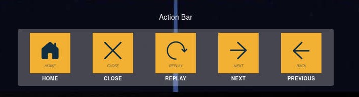
Action Bar
Actionbars are collapsible panels with actionable buttons (called items).
Compatibility
| Fullscreen/Embed Mode | VR/Headset Mode |
|---|---|
| ✅ | ➖ |
Properties
- Position: Top/Right/Bottom/Left.
warning
One position on the screen can only display one action bar a time
- Label: A small optional heading that will displayed near the actionbar.
- Collapsible: Check this if you want to show a collpse notch on the actiobar.
note
Collapsing the actionbar isn't the same as hiding the actionbar. A collapsed actionbar can pulled up again by the user using the notch. A hidden actiobar can't.
- Color
- Opacity
Rules
- Events:
When actionbar item (n)has been clicked/is clicked - Actions:
Then actionbar shouldappear/disappear/toggle show/hide