Text
Description
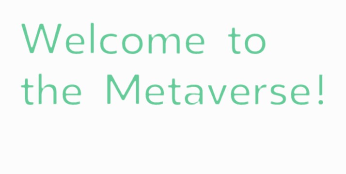
Add a 2D Text Frame
Usage
- Can be used as a Button
- Text Description
- Indicator/Hotspot
Looks 
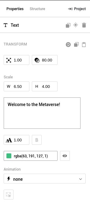
Properties
| Property | Description |
|---|---|
 Transform | The Transform section in the Properties tab can be used to manually set the position, rotation and scale of the element in the X, Y and Z coordinates |
 Scale | Scale can be used to enlarge or shrink the element uniformly |
 Width and Height | Width and Height define the aspect ratio of the Element frame. |
| Text | Text content to be displayed in the element |
| Font Size | Font size of the text content in the element |
| Bold | Bold toggle for the text content in the element |
| Color | Color sets the display color of the element. Hex code values or RGBA values may be used. |
 Opacity | Opacity can be used to control the transparency of the element. 1.00 is Opaque and 0.00 is Invisible. An element with 0.00 opacity will still remain interactive. |
 Hidden | Hiding the element makes the element invisible and disables all interaction with it as well. |
 Animation | There are 3 types of default animations - Bounce, Rotate, Fade. These can be used to give an element visual emphasis. |
Rules
When Event
- is clicked
- is hovered
- is pressed
- is released
Then Actions
- appear
- disappear
- toggle show/hide
Compatibility
| Android (Google Chrome) | iOS (Google Chrome) | Oculus Go | PC (Google Chrome) |
|---|---|---|---|
| Yes | Yes | Yes | Yes |